Defining the design tokens architecture for Boubyan Bank
Reading time: 3 minutes.
Defining the design tokens architecture for Boubyan Bank
Reading time: 3 minutes.
When establishing the tokens architecture, We implemented the three-tier design token structure to ensure scalability and future-proofing. Our goal was to create a robust token system for present needs while keeping future requirements in mind.
When establishing the tokens architecture, We implemented the three-tier design token structure to ensure scalability and future-proofing. Our goal was to create a robust token system for present needs while keeping future requirements in mind.
When establishing the tokens architecture, We implemented the three-tier design token structure to ensure scalability and future-proofing. Our goal was to create a robust token system for present needs while keeping future requirements in mind.
The process
The process
The process
We created a core library containing our primitive tokens, representing the fundamental design decisions of our brand, which remain consistent across projects. We then linked other libraries to this core library and mirrored this approach in development. Regardless of the technology used, whether SwiftUI or React, all projects read the global tokens from the same JSON file. This ensures scalability, so any changes to the main global tokens are reflected across all projects and in Figma.
We created a core library containing our primitive tokens, representing the fundamental design decisions of our brand, which remain consistent across projects. We then linked other libraries to this core library and mirrored this approach in development. Regardless of the technology used, whether SwiftUI or React, all projects read the global tokens from the same JSON file. This ensures scalability, so any changes to the main global tokens are reflected across all projects and in Figma.
We created a core library containing our primitive tokens, representing the fundamental design decisions of our brand, which remain consistent across projects. We then linked other libraries to this core library and mirrored this approach in development. Regardless of the technology used, whether SwiftUI or React, all projects read the global tokens from the same JSON file. This ensures scalability, so any changes to the main global tokens are reflected across all projects and in Figma.
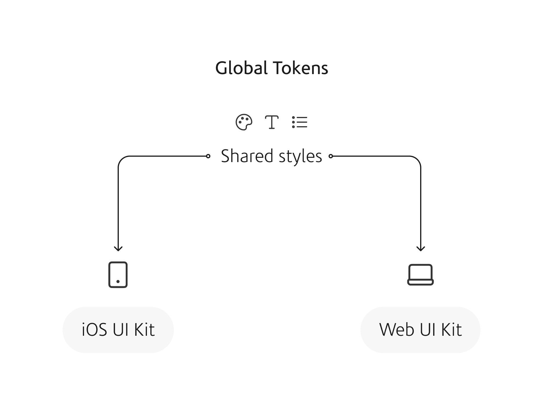
We've also applied a similar structure to our components. We maintain a core components library for elements like buttons and input fields that remain consistent across projects. However we also have project-specific component libraries to accommodate unique requirements, such as components that work on the app but not on the website.
We've also applied a similar structure to our components. We maintain a core components library for elements like buttons and input fields that remain consistent across projects. However we also have project-specific component libraries to accommodate unique requirements, such as components that work on the app but not on the website.
We've also applied a similar structure to our components. We maintain a core components library for elements like buttons and input fields that remain consistent across projects. However we also have project-specific component libraries to accommodate unique requirements, such as components that work on the app but not on the website.
Themeing
Themeing
Themeing
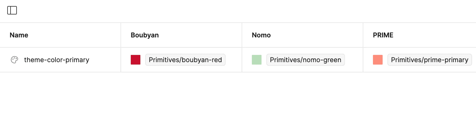
This approach also supports theming. By changing the primitive tokens based on the brand we're designing for, we can change the UI of the components to match the brand's identity without changing the core structure of the components themselves.
This approach also supports theming. By changing the primitive tokens based on the brand we're designing for, we can change the UI of the components to match the brand's identity without changing the core structure of the components themselves.
This approach also supports theming. By changing the primitive tokens based on the brand we're designing for, we can change the UI of the components to match the brand's identity without changing the core structure of the components themselves.
Integration with other tools
Integration with other tools
Integration with other tools
The great thing about the three-tier token architecture is that it follows the W3C Design Tokens Community Group standards, which also align with Figma and most design system tools. By using this architecture for our tokens, integrating design system tools into our workflow becomes much easier, boosting productivity and making collaboration with developers smoother.
The great thing about the three-tier token architecture is that it follows the W3C Design Tokens Community Group standards, which also align with Figma and most design system tools. By using this architecture for our tokens, integrating design system tools into our workflow becomes much easier, boosting productivity and making collaboration with developers smoother.
The great thing about the three-tier token architecture is that it follows the W3C Design Tokens Community Group standards, which also align with Figma and most design system tools. By using this architecture for our tokens, integrating design system tools into our workflow becomes much easier, boosting productivity and making collaboration with developers smoother.
Ending note
Ending note
Ending note
Defining a foundational token architecture is crucial. We approached this task with scalability and usability in mind, adhering to the W3C Design Tokens Community Group standards. This ensures our architecture is systematic, consistent with industry standards, and seamlessly integrates with Figma and other design system tools.
Defining a foundational token architecture is crucial. We approached this task with scalability and usability in mind, adhering to the W3C Design Tokens Community Group standards. This ensures our architecture is systematic, consistent with industry standards, and seamlessly integrates with Figma and other design system tools.
Defining a foundational token architecture is crucial. We approached this task with scalability and usability in mind, adhering to the W3C Design Tokens Community Group standards. This ensures our architecture is systematic, consistent with industry standards, and seamlessly integrates with Figma and other design system tools.