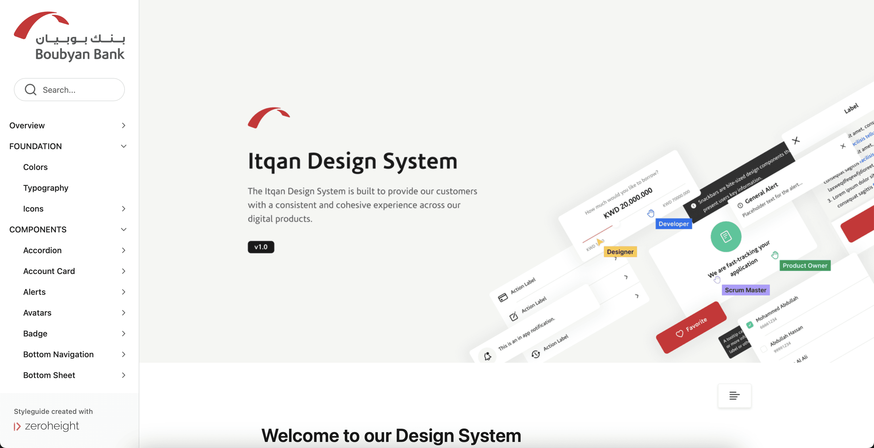
Building a design system for Boubyan Bank
Reading time: 5 minutes.
Building a design system for Boubyan Bank
Reading time: 5 minutes.
Creating the design system for Boubyan was a fun yet challenging project. It was my first experience working on a design system, and building one from scratch turned into an amazing journey filled with learning and new experiences.
Creating the design system for Boubyan was a fun yet challenging project. It was my first experience working on a design system, and building one from scratch turned into an amazing journey filled with learning and new experiences.
Creating the design system for Boubyan was a fun yet challenging project. It was my first experience working on a design system, and building one from scratch turned into an amazing journey filled with learning and new experiences.
The problem
The problem
The problem
Our retail banking app is our top product, getting a lot of attention and workload because it brings the most benefits to the bank. However, the app had many inconsistencies in its interface, making it hard for designers and developers to work with. We wanted to set a standard across the app, unify our components, and provide clear documentation and guidelines for our team.
Our retail banking app is our top product, getting a lot of attention and workload because it brings the most benefits to the bank. However, the app had many inconsistencies in its interface, making it hard for designers and developers to work with. We wanted to set a standard across the app, unify our components, and provide clear documentation and guidelines for our team.
Our retail banking app is our top product, getting a lot of attention and workload because it brings the most benefits to the bank. However, the app had many inconsistencies in its interface, making it hard for designers and developers to work with. We wanted to set a standard across the app, unify our components, and provide clear documentation and guidelines for our team.
Our approach
Our approach
Our approach
We started by doing a UI audit to identify all the components that needed to be unified and to highlight inconsistencies. For instance, we had multiple styles of a primary button, and on average, each component had at least two different variants that served the same purpose. This added unnecessary complexity to the interface and wasted designers' time as they tried to figure out which variant to use in their designs.
We started by doing a UI audit to identify all the components that needed to be unified and to highlight inconsistencies. For instance, we had multiple styles of a primary button, and on average, each component had at least two different variants that served the same purpose. This added unnecessary complexity to the interface and wasted designers' time as they tried to figure out which variant to use in their designs.
We started by doing a UI audit to identify all the components that needed to be unified and to highlight inconsistencies. For instance, we had multiple styles of a primary button, and on average, each component had at least two different variants that served the same purpose. This added unnecessary complexity to the interface and wasted designers' time as they tried to figure out which variant to use in their designs.
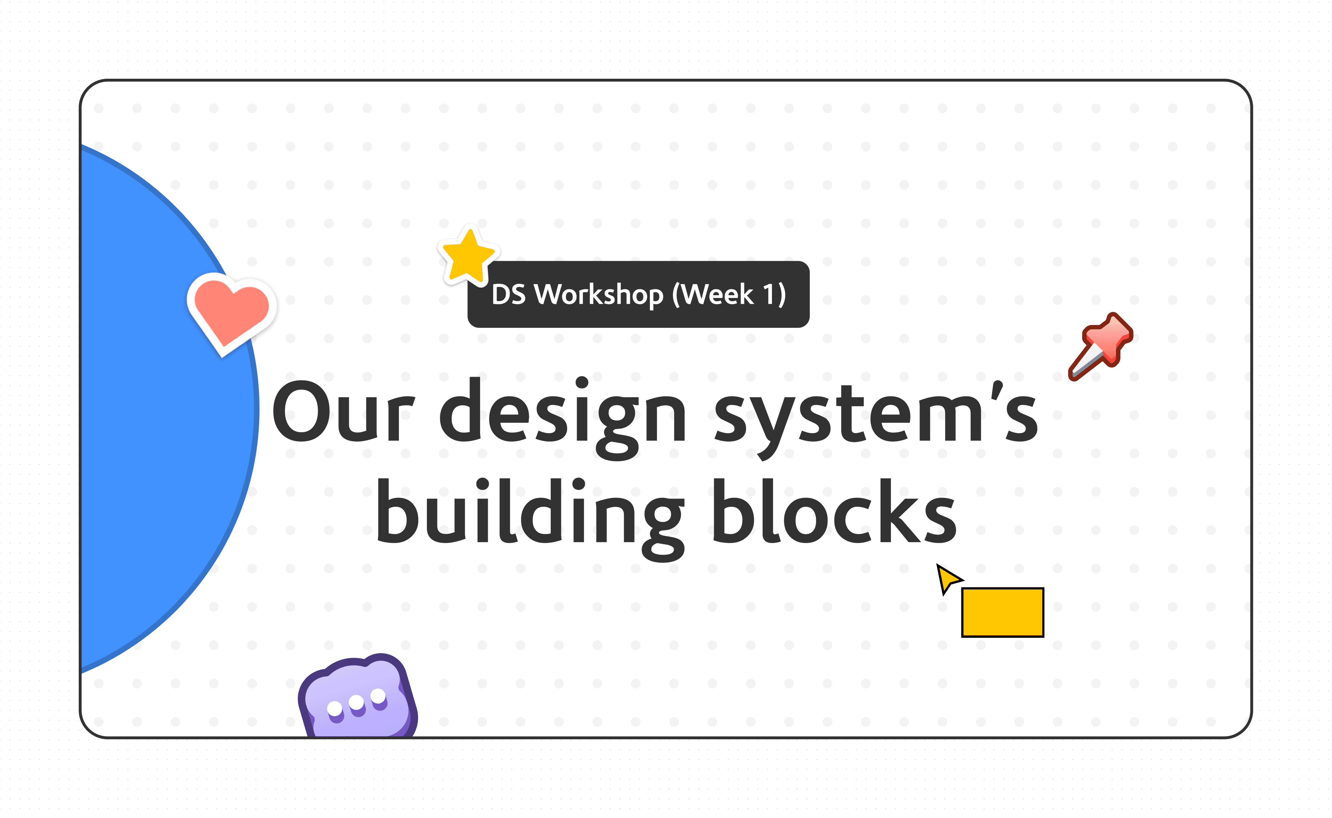
Establishing the tokens architecture
Establishing the tokens architecture
Establishing the tokens architecture
We chose the three-tier token structure to ensure scalability. Our goal was to create a robust token system for present needs while keeping future requirements in mind. You can read about how we implemented the tokens architecture in depth here.
We chose the three-tier token structure to ensure scalability. Our goal was to create a robust token system for present needs while keeping future requirements in mind. You can read about how we implemented the tokens architecture in depth here.
We chose the three-tier token structure to ensure scalability. Our goal was to create a robust token system for present needs while keeping future requirements in mind. You can read about how we implemented the tokens architecture in depth here.
Building the components
Building the components
Building the components
For each component, we identified the necessary variants, behavior, constraints, and whether or not it should be responsive. We built the components in Figma using auto layout, variants, and later, we refactored the components with the new component props and nested instances features.
Maintaining components is important, but building them with maintainability in mind can sometimes make them harder for designers to use. My approach prioritized usability. I didn't want to slow down designers by making them spend too much time figuring out the components and properties panel. Instead, I aimed for intuitive and easy-to-use component properties so designers could focus on improving user experience and solving problems.
Testing the components
Testing the components
Testing the components
I prepared my own mini checklist to test each component's functionality once I finished building it. This included checking if auto layout was applied, ensuring icons were linked to our library, and verifying that the component behaved as intended.
We also tested usability of the components by inviting some designers to testing sessions. We observed how they used the component, whether it was intuitive, if they understood how it’s used, and if the documentation was easy to follow.
Design system documentation
Design system documentation
Design system documentation
We chose zeroheight for documenting our components because it's easy to use and provides a centralized place where both designers and developers can add their documentation. It's a simple way to maintain a single source of truth that everyone can access.
We wrote the main documentation in zeroheight but added snippets in Figma to give designers a quick overview of the components. This often prevented the need for them to read the full documentation elsewhere, as the component details were clear enough. We also briefly experimented with a plugin called "Gist" for documentation, but found that inline documentation in the component properties was the most intuitive option for designers.
Onboarding designers and developers
Onboarding designers and developers
Onboarding designers and developers
Personally, this was one of the most enjoyable tasks for me. It was my first time leading a workshop on this scale, so I had a lot to learn. I conducted a 5 weeks workshop with the design team to onboard them to the design system. We did activities that covers our foundations, token structure, the difference between components and patterns, guidelines for using snowflakes, and our contribution model.
Additionally, whenever new designers or developers joined our team, I did a workshop to introduce them to our design system. This workshop familiarized them with our token structure and provided resources and documentation for further information.
Ending note
Ending note
Ending note
I had a lot of fun working on Boubyan's design system. It's an ongoing journey because a design system is a living product that needs continuous updates. I enjoy how we learn new things every day. It began with learning how to create a design system from scratch and how to communicate and collaborate effectively with developers. Now, we're focused on maintaining the design system and ensuring seamless contributions and adoption from other teams. As our design system evolves, so does our understanding and experience, making each day a rewarding experience of growth and innovation.
I had a lot of fun working on Boubyan's design system. It's an ongoing journey because a design system is a living product that needs continuous updates. I enjoy how we learn new things every day. It began with learning how to create a design system from scratch and how to communicate and collaborate effectively with developers. Now, we're focused on maintaining the design system and ensuring seamless contributions and adoption from other teams. As our design system evolves, so does our understanding and experience, making each day a rewarding experience of growth and innovation.
I had a lot of fun working on Boubyan's design system. It's an ongoing journey because a design system is a living product that needs continuous updates. I enjoy how we learn new things every day. It began with learning how to create a design system from scratch and how to communicate and collaborate effectively with developers. Now, we're focused on maintaining the design system and ensuring seamless contributions and adoption from other teams. As our design system evolves, so does our understanding and experience, making each day a rewarding experience of growth and innovation.